Content
You can absolutely use different wood floors in the same house—and make it look intentional—if you limit the number of “wood stories” to two or three, keep undertones consistent, and use clean transitions at doorway or zone boundaries.
The most reliable approach is simple: pick one “anchor” wood for your main sightlines (often the largest connected area), then choose secondary woods that either match undertone and sheen closely (quiet blend) or contrast clearly (bold separation). Avoid the messy middle where colors almost match but don’t.
Fast rules that keep different wood floors looking cohesive
Use these guardrails first, then fine-tune room by room.
- Limit it to 2–3 woods max across one floor level; more usually reads like patchwork.
- Match undertones: keep most woods in the same temperature family (warm/golden/red vs cool/gray/neutral).
- Separate by function: public spaces share the anchor wood; private spaces (bedrooms) can switch as a group.
- Keep sheen consistent within sightlines (for example, all matte/satin) so light reflects similarly.
- Use clear boundaries: transitions belong at doorways, hallway ends, stair landings, or where flooring direction changes.
- Either “match closely” or “contrast clearly”—avoid near-matches that look accidental.
A practical color spacing target
If you’re choosing between a blend or contrast, aim for a visible difference in lightness. In real homes, a noticeable lightness gap (roughly 2–3 “shades” apart) reads intentional, while small differences tend to look like a mismatch.
Best wood floor combinations by room layout
Different wood floors work best when the changes follow how you actually move through the house. Use these common patterns to decide where switches make sense.
| Home pattern | What to do | Why it works |
|---|---|---|
| Open concept (living/dining/kitchen connected) | Use one anchor wood throughout; change floors only in enclosed rooms | Continuous sightlines amplify mismatches; one wood reads premium and calm |
| Traditional plan (rooms off a hallway) | Anchor wood in hall; secondary wood in bedrooms as a group | Doorways create natural transition points |
| Split levels / multiple stair landings | Switch at landings; keep stair treads consistent | Landings act as visual “chapters” between zones |
| Older home with additions | Use a deliberate contrast (for example, wide planks in the addition) | Turns an unavoidable change into a design feature |
Quick examples you can copy
- Main level: light oak (matte) everywhere; office: walnut (matte) behind a door.
- Upstairs bedrooms: same oak as downstairs but in a narrower plank; bathrooms stay tile.
- Addition: reclaimed pine with visible character; transition at the threshold with a simple reducer.
How to match wood undertones, width, and sheen
When people say floors “don’t go together,” it’s usually one of three issues: undertone clash, plank proportion mismatch, or reflective mismatch (sheen). Fix those and most combinations work.
Undertone: warm vs cool vs neutral
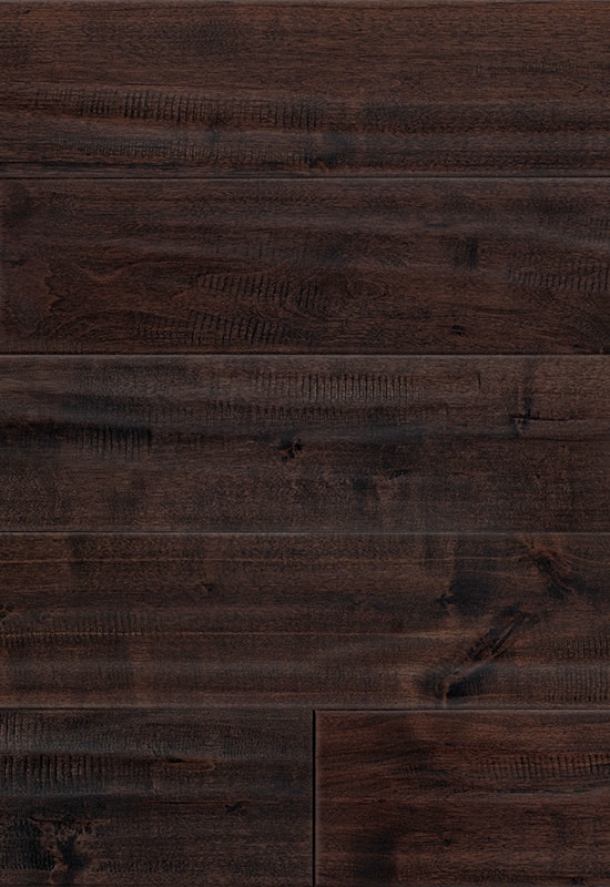
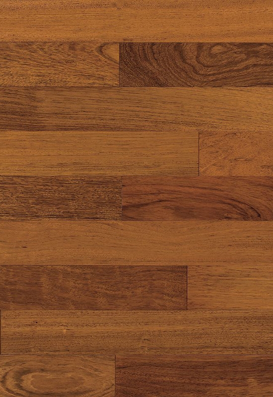
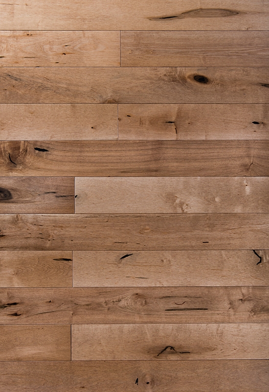
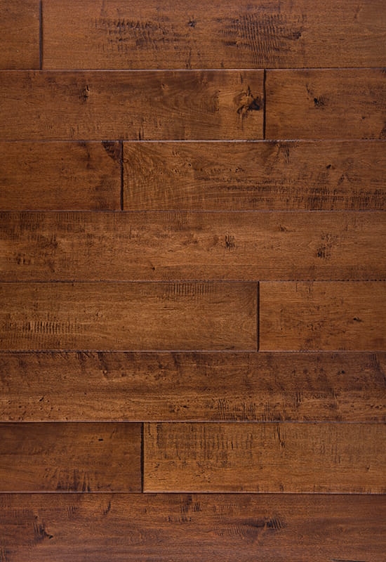
Keep at least two woods in the same undertone family. For instance, honey oak and warm walnut can coexist; gray-washed oak next to red-toned cherry often fights.
Plank width: keep proportions intentional
Mixing widths is fine if it’s a clear choice. A practical guideline is to avoid “almost the same” widths in adjacent areas. Example: 2.25" next to 3.25" can look accidental; 2.25" next to 5–7" reads intentional.
Sheen: the overlooked mismatch
If one floor is glossy and another is matte, light will expose the difference even if color is close. In connected spaces, keep sheen aligned—most modern homes look cohesive with matte or satin across the level.
Transitions that make changes look planned
The transition detail is what separates “designed” from “renovation leftovers.” Even great wood choices look wrong with a sloppy break line.
Where transitions should land
- Centered under a doorway (so each room reads as its own zone)
- At the end of a hallway (creates a natural stop)
- At a stair landing (best spot for level-to-level changes)
- Along an architectural line (like a beam, column line, or built-in edge)
Transition pieces: keep them simple
If floors differ in height, use a reducer that matches one side cleanly. If heights are flush, a thin T-molding or a clean butt joint (when allowed by installation specs) keeps the look modern. Avoid busy multi-strip thresholds unless you’re matching a historic style.
Common mistakes and how to avoid them
Most “different wood floor” regrets are predictable. Fix these before you buy materials.
- Too many species: turning every room into a new floor sample. Choose an anchor, then one secondary.
- Near-match colors: two browns that aren’t the same look like a mistake. Either match tightly or separate clearly.
- Random direction changes: if plank direction flips without a reason, the eye reads it as an error. Change direction only with a boundary.
- Ignoring lighting: warm bulbs can make neutral woods look yellow; cool daylight can gray them out. View samples in morning and evening light.
- Different textures in the same sightline: heavy wire-brush next to smooth often clashes more than color does.
A simple in-home sampling method
Lay your top two floor samples next to the existing floor and take photos from three distances: 3 feet, 10 feet, and across the room. If the photo reads cohesive at 10 feet and across-the-room, it will usually feel cohesive in real life.
Conclusion: the simplest winning plan
Pick one anchor wood for your largest connected area, then use a secondary wood only in clearly separated zones (bedroom wing, office, addition). Match undertones and sheen, and place transitions at doorways or landings. Done this way, different wood floors look deliberate, upgraded, and easy to live with.


 English
 中文简体
中文简体 Français

 +86-572-2118015
 No.598. Gaoxin Road, Huanzhu Industrial Zone, Huzhou City, Zhejiang Province, China, 313000